Building a Recommender System using Mahout

Have you ever wonder how Amazon determines “customers who bought this item also bought…” info? They just simply implemented a recommender system. Netflix also uses similar algorithms to determine what to recommend to watch based on user’s data trail in the system. Now if you are interested in knowing more about how a recommender system can be implemented in a simple example, here we go…

First, we need a rider for our huge user data(a.k.a. Big Data), that is Apache Mahout! Mahout is an open source Machine Learning Library that contains algorithms for clustering, classification and recommendation. It is written in Java and is linearly scalable with data. It supports batch processing of sequential data where data size is irrelevant. Most importantly, it can be executed in memory or on a distributed mode.

Recently, we see Mahout shifting from Hadoop/HDFS towards Spark as it provides better support for iterative machine learning algorithms using the in-memory approach.

Now let us dive more deeply into what recommendation algorithm and techniques we can use.

Recommendation algorithm that is frequently used is called Collaborative Filtering.

Collaborative Filtering

Collaborative filtering technique uses historical data on user behavior, such as clicks, views, and purchases, to provide better recommendations.

Item-based recommender – similar users from a given neighborhood are identified and item recommendations are given based on what similar users already bought or viewed, which a particular user did not buy or view yet.

User-based recommender – An item-based recommender measures the similarities between different items and picks the top k closest (in similarity) items to a given item in order to arrive at a rating prediction or recommendation for a given user for a given item.

Matrix factorization-based recommender– new items and new users tend to lack sufficient historical data to predict good recommendations. This is known as the cold start problem ,rating can be induced by a mathematical techniques.

There are different types of similarity measures available to use to build recommenders. Here are some of the most popular ones:

  • PearsonCorrelationSimilarity: measure to find similarity between two users.
  • EuclideanDistanceSimilarity: This measures the Euclidean distance between two users or items as dimensions and preference values given will be values along those dimensions. EuclideanDistanceSimilarity will not work if you have not given preference values.
  • TanimotoCoefficientSimilarity: This is applicable if preference values consist of binary responses (true and false). TanimotoCoefficientSimilarity is the number of similar items two users bought or the total number of items they bought.
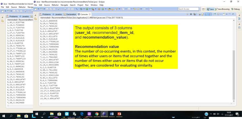
  • LogLikelihoodSimilarity: This is a measure based on likelihood ratios. The number of co-occurring events, in this context, the number of times either users or items that occurred together and the number of times either users or items that do not occur together, are considered for evaluating similarity.
  • SpearmanCorrelationSimilarity: the relative rankings of preference values are compared instead of preference values.
  • UncenteredCosineSimilarity: This is an implementation of cosine similarity. The angle between two preference vectors is considered for calculation.

We should always consider the percentage of error in order to measure the quality of our recommendations. We can do it by evaluating how closely the estimated preferences match the actual preferences of a user. How it is done basically is that we split the data set into two portions – training data set and testing data set.

The training dataset is used to create the model, and evaluation is done based on the test dataset, and we can calculate the evaluation percentage according to IR-based Evaluation method as follows:

Picture1

Precision is the proportion of top recommendation retrieved to the total of the recommendation.

Recall is the recommended items retrieved divided by total of recommendations available.

The F1 score can be interpreted as a weighted average of the precision and recall, where an F1 score reaches its best value at 1 and worst score at 0.

In simple words, The precision is the proportion of recommendations that are good recommendations, and recall is the proportion of good recommendations that appear in top recommendations. 

Recommending items to a user:

Here is the content of the input file we used for our example.

input_data

I wrote this recommender in Java using Mahout libraries. It could also be implemented in Python. In this example, we recommend 5 items to first 10 users using LogLikelihoodSimilarity measure in Mahout.

multi_items

And here is the output after running the code.  You will see 5 recommended items per user in the following format.

output

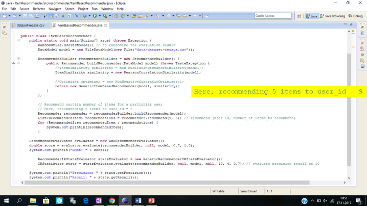
Implementing Item-based Recommender:

An item-based recommender measures the similarities between different items and picks the top k closest (in similarity) items to a given item in order to arrive at a rating prediction or recommendation for a given user for a given item.

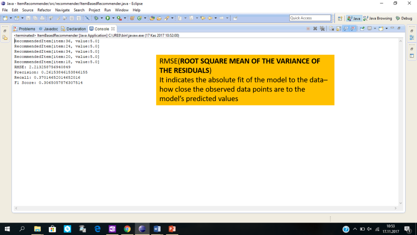
The evaluation is done for metrics Root Mean Square Error (RMSE), Precision, Recall, and F1 Score. Certain number of items are also recommended for a particular user.

itembased

Here is the output we get.

itembased_output

And here is the code I implemented for User-based recommender and the output.

userbased

userbased_output

If you would like to try it yourself, here is a good tutorial that you can benefit on Youtube.

K-Means Clustering in Python

Here I want to include an example of K-Means Clustering code implementation in Python. K-Means is a popular clustering algorithm used for unsupervised Machine Learning. In this example, we will fed 4000 records of fleet drivers data into K-Means algorithm developed in Python 3.6 using Panda, NumPy and Scikit-learn, and cluster data based on similarities between each data point, identify the groups of drivers with distinct features based on distance and speed.

This is a sample of the data that is used for the analysis, it contains 4000 rows each representing each driver, the  mean distance driven per day and the mean percentage of time a driver was >5 mph over the speed limit, these features will be the basis for the grouping[1].

DriverID Distance Feature Speeding Feature
3423311935


71.24 28.0

Finding the optimum number of k’s, how many clusters should the data be grouped into, this will be done by testing for different number of k’s and using the “elbow point”, where we plot the mean of distances between each point in the cluster and the centroid against the number of k’s used for the test, to help determine the number of suitable clusters for this dataset.

First, we start off by importing the following packages; Pandas, Numpy  is a package for scientific computing with Python[1], scikit-learn package for machine learning,  sklearn.cluster [2]for clustering were we use the Kmeans , from the matplotlib we used the pyplot package to create a visual representation of the data, and scipy lib for Euclidian distance calculation for elbow method.

The steps will describe the code in details and how these packages were used:

1.    Setup the environment and load the data

import

2.      Importing and preparing data

Here we import the data from data.csv file into Pandas dataframe object(“data”) with column names V1 and V2. V1 referring to Distance Feature and Speeding Feature respectively. Then,we transform two vectors V1 and V2 into a NmPy array object and name it X. X represents our primary data model to fit into Scikit KMeans algorithm later.

prepData

3.    Visualize Raw Data and initial centroids

Here we calculate initial set of random centroids for K value 2, and plot both the raw data and initial centroids on the scatter plot. K represents the number of clusters, we start by setting it to 2, the NumPy package is used to generate random values and assign to centroids.

plotInitialCentroids

Here is the ouput when you run this code. Initial centroids are indicated as green stars. Black dots represent the raw fleet data. This is how initial data looks like before running clustering.

rawdata

4.    Build K-Means Model to Run with a given K-value

Provided  we have the data in required format “X”, here we create the KMeans model and specify the number of clusters(K value).  Next, we fit the model to the data, generate cluster labels and compute centroids.

KModel

5.    Select k, run algorithm and plot the clusters

 Now, we run the K-Means algorithm for K values 2, 4 and 6. For each K-value, we compute the centroids and iterate doing the same until the error value reaches the zero. In other words, for each cluster, when the distance between old centroid value and new calculated centroid value becomes zero, we stop. This is called stopping criteria for calculating centroids per cluster accurately. However, for coding purposes, here we don’t need to do error calculation explicity as it is already taken care of inside SkLearn KMeans model.

iterate

Starting with k =2,4,6 we ran the code, Squared Euclidean distance measures the distance between each data point and the centroid, then the centroid will be re-calculated until the stop criteria and the following are screen shots of the results.

Cluster_K2

Cluster_K4

Cluster_K6

6.    Selecting optimum k

The technique we use to determine optimum K, the number of clusters, is called the elbow method.

Here is the code I implemented for Elbow method.

elbowpoint

By plotting the number of centroids and the average distance between a data point and the centroid within the cluster we arrive at the following graph.

Elbow

At first glance point k=2 appears as the elbow point, but in this case, it’s only the first point of test so the real “elbow point”[4] where average distance stops decreasing sharply and is no longer worth the computational overhead is k=4, however this test remains subjective and is better to run other tests to determine the value of k such as X-means or others.

In conclusion, as a result of our analysis we can see that there are four main groups of drivers:

Cluster 1 – Short distance, low speed

Cluster 2 – Short distance, medium speed

Cluster 3 – Long distance, low speed

Cluster 4 – Long distance, high speed

Cluster_K4Optimum

It can be claimed that as inter-city and rural drivers, in Cluster 1 for example due to traffic jams and frequent stops the speed as well as the distance will be short, while in group Cluster 3 though the distance crossed is long speed is low and this can be justified in case of shipping trucks…etc.

Unfortunately, this test is not sufficient on it’s own to cluster data and draw conclusions, especially since the data is cluster only on two feature values (distance and speed).  This clustering can be enhanced using further engineering to choose the data metrics in a meaningful way to enhance the analysis.

Moreover, choosing the number of ks using the elbow method is subjective, other validation tests suchas X-means that tries to optimize the Bayesian Information Criteria (BIC) or the Akaike Information Criteria (AIC)or cross validation [5].

Hope this helps!

References


[1] http://scikit-learn.org/stable/auto_examples/linear_model/plot_lasso_model_selection.html

[2] https://www.inovex.de/blog/disadvantages-of-k-means-clustering/

[3] https://docs.scipy.org/doc/numpy/user/index.html

[4] http://scikit-learn.org/stable/modules/clustering.html#k-means

[5] https://www.datascience.com/blog/k-means-clustering