
Here I want to include an example of K-Means Clustering code implementation in Python. K-Means is a popular clustering algorithm used for unsupervised Machine Learning. In this example, we will fed 4000 records of fleet drivers data into K-Means algorithm developed in Python 3.6 using Panda, NumPy and Scikit-learn, and cluster data based on similarities between each data point, identify the groups of drivers with distinct features based on distance and speed.
This is a sample of the data that is used for the analysis, it contains 4000 rows each representing each driver, the mean distance driven per day and the mean percentage of time a driver was >5 mph over the speed limit, these features will be the basis for the grouping[1].
| DriverID | Distance Feature | Speeding Feature |
| 3423311935
|
71.24 | 28.0 |
Finding the optimum number of k’s, how many clusters should the data be grouped into, this will be done by testing for different number of k’s and using the “elbow point”, where we plot the mean of distances between each point in the cluster and the centroid against the number of k’s used for the test, to help determine the number of suitable clusters for this dataset.
First, we start off by importing the following packages; Pandas, Numpy is a package for scientific computing with Python[1], scikit-learn package for machine learning, sklearn.cluster [2]for clustering were we use the Kmeans , from the matplotlib we used the pyplot package to create a visual representation of the data, and scipy lib for Euclidian distance calculation for elbow method.
The steps will describe the code in details and how these packages were used:
1. Setup the environment and load the data

2. Importing and preparing data
Here we import the data from data.csv file into Pandas dataframe object(“data”) with column names V1 and V2. V1 referring to Distance Feature and Speeding Feature respectively. Then,we transform two vectors V1 and V2 into a NmPy array object and name it X. X represents our primary data model to fit into Scikit KMeans algorithm later.

3. Visualize Raw Data and initial centroids
Here we calculate initial set of random centroids for K value 2, and plot both the raw data and initial centroids on the scatter plot. K represents the number of clusters, we start by setting it to 2, the NumPy package is used to generate random values and assign to centroids.

Here is the ouput when you run this code. Initial centroids are indicated as green stars. Black dots represent the raw fleet data. This is how initial data looks like before running clustering.

4. Build K-Means Model to Run with a given K-value
Provided we have the data in required format “X”, here we create the KMeans model and specify the number of clusters(K value). Next, we fit the model to the data, generate cluster labels and compute centroids.

5. Select k, run algorithm and plot the clusters
Now, we run the K-Means algorithm for K values 2, 4 and 6. For each K-value, we compute the centroids and iterate doing the same until the error value reaches the zero. In other words, for each cluster, when the distance between old centroid value and new calculated centroid value becomes zero, we stop. This is called stopping criteria for calculating centroids per cluster accurately. However, for coding purposes, here we don’t need to do error calculation explicity as it is already taken care of inside SkLearn KMeans model.
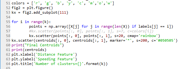
Starting with k =2,4,6 we ran the code, Squared Euclidean distance measures the distance between each data point and the centroid, then the centroid will be re-calculated until the stop criteria and the following are screen shots of the results.


6. Selecting optimum k
The technique we use to determine optimum K, the number of clusters, is called the elbow method.
Here is the code I implemented for Elbow method.

By plotting the number of centroids and the average distance between a data point and the centroid within the cluster we arrive at the following graph.

At first glance point k=2 appears as the elbow point, but in this case, it’s only the first point of test so the real “elbow point”[4] where average distance stops decreasing sharply and is no longer worth the computational overhead is k=4, however this test remains subjective and is better to run other tests to determine the value of k such as X-means or others.
In conclusion, as a result of our analysis we can see that there are four main groups of drivers:
Cluster 1 – Short distance, low speed
Cluster 2 – Short distance, medium speed
Cluster 3 – Long distance, low speed
Cluster 4 – Long distance, high speed

It can be claimed that as inter-city and rural drivers, in Cluster 1 for example due to traffic jams and frequent stops the speed as well as the distance will be short, while in group Cluster 3 though the distance crossed is long speed is low and this can be justified in case of shipping trucks…etc.
Unfortunately, this test is not sufficient on it’s own to cluster data and draw conclusions, especially since the data is cluster only on two feature values (distance and speed). This clustering can be enhanced using further engineering to choose the data metrics in a meaningful way to enhance the analysis.
Moreover, choosing the number of ks using the elbow method is subjective, other validation tests suchas X-means that tries to optimize the Bayesian Information Criteria (BIC) or the Akaike Information Criteria (AIC)or cross validation [5].
Hope this helps!
References
[1] http://scikit-learn.org/stable/auto_examples/linear_model/plot_lasso_model_selection.html
[2] https://www.inovex.de/blog/disadvantages-of-k-means-clustering/
[3] https://docs.scipy.org/doc/numpy/user/index.html
[4] http://scikit-learn.org/stable/modules/clustering.html#k-means
